COLOUR AS INTERSEMIOTIC TRANSLATION IN EVERYDAY COMMUNICATION: A SOCIOSEMIOTIC APPROACH
Aristotle University of Thessaloniki, Greece
Abstract
Intersemiosis characterises the whole semiotic phenomenon, which is based on what Jakobson (2001 [1959]) calls intersemiotic translation or transmutation, that is the interpretation of verbal signs by means of signs of non-verbal systems. Jakobson did not give examples of transmutation between language and colour, a semiotic system which is usually included within the iconic sign system. The autonomy of the semiotic system of colour was underlined by the Belgian semioticians, known as Groupe μ (1992) who elaborated on Barthes’ (1964) classification of semiotic signs, criticising linguistic imperialism and emphasising the specificity of the visual sign. For Groupe μ (1995), there is evidence that the plastic element (colour, form, texture) is autonomous from the iconic representation, and in fact plastic and iconic elements complement each other. This autonomy allows for colour to serve as one of the two poles in intersemiotic translation. In my study, I will present cases of everyday communication (commercial signs, advertisements, course books, etc.) where this intersemiosis between language and colour is realized, and I will examine also the reasons intersemiosis was chosen.
1. Culture and Translation
The fact that translation is a cultural product, a semiotic product, has been explained in detail by translation semioticians and especially by the Tartu-Moscow School of Semiotics. Thus, views such as Toporov’s (1992: 30), “that [culture] is not only the place where meanings are born, but the space in which they are being exchanged,‘transmitted’ and seek to be translated from one cultural language into another”, or Torop’s (2008: 257), that “[t]he ontology of translation semiotics rests on the recognition that culture works in many respects as a translation mechanism [...]”, aren’t surprising. Instead, they enhance the view that translation and culture are two aspects of the same message.
Culture and translation are interdependent and go hand in hand (see Torop 2002: 603). It therefore makes sense why Eco approached the translation process central to cultural communication. In the framework of cultural communication, semiotic systems coexist, cooperate and are then translated, since “[c]ulture continuously translates signs into signs, and definitions into definitions, words into icons, icons into ostensive signs, ostensive signs into new definitions, new definitions into propositional functions, propositional functions into exemplifying sentences, and so on; in this way it proposes to its members an uninterrupted chain of cultural units, and thus translating and explaining them” (Eco 1979: 71).
Fabbri (2008 [1998]: 112) aptly remarks that when translating a linguistic sign into a non-linguistic sign there may be some informational loss, since non-verbal semiotic systems that are different from language may speak for themselves, may be self-interpreting, and may also interpret other sign systems through expression substances that translate, in part, the meaning contained in the original sign. As Fabbri points out, the true limit of translation lies in the difference between the materials of expression.
Translation and its corresponding informational loss had been studied in semiotic and translation terms, especially in the context of intersemiotic translation between verbal and visual semiotic systems. The purpose of this study is to examine translation, transduction as Fabbri (2008 [1998]: 161) mentions at the end of his book, between the verbal and colour semiotic systems. It is a field which has not been probed into by semioticians. But before we examine the translatability of colour, we will focus on its communication function as a non-verbal semiotic system.
2. Colour as a vehicle of sociosemiotic communication
Some years ago, van Leeuwen (2011: 12) mentioned that “[…] in the twentieth century, after a rather ‘monochrome’ period, colour began to extend its semiotic reach […] began to play a more important role in the everyday expression of ideational, interpersonal and textual meanings, while at the same time retaining its sensual attraction, so investing social communication with pleasure and sensuality”. I am in agreement with van Leeuven’s observation, adding that contemporary culture, as we will see later, is increasingly based on the pleasure and sensuality of colour in everyday communication, which has passed onto the level of intersemiotic communication. In addition, as Deely (2002: 68) mentions, “[…] human understanding finds its operational existence initially in terms of intersemiosis which perception makes possible as developing around a sensory core”.
Besides the feature of sensuality, colour, as a carrier of meaning, is one of the dominant systems of non-verbal communication. For Kress and van Leeuwen (2002) and van Leeuwen (2011), colour is also used to convey ‘interpersonal’ meaning. Just as language allows us to realize speech acts, colour also allows us to realize colour acts. This induction permits me to support that since speech acts are translatable, colour acts must also be translatable.
Edeline (2010: 218), one of the founding members of Groupe µ, a group of Belgian 20th-century semioticians, divides colour, in terms of its associations, into two categories:sociochrome, which evolves with society, its religious symbols, its trends, and has the resultant conventional associations; and idiochrome, which evolves based on personal experiences that commit to memory pleasant, warm, anxiety-ridden, frightening and other situations that provide metonymic or synaesthetic effect associations.
In December 12th, 2006, when, for example, Chilean Defence Minister Vivianne Blanlot attended the funeral of General Augusto Pinochet at the Military Academy in Santiago wearing a white suit (figure 1), there was uproar among those present, since her attire was thought to be offensive and to show lack of respect towards the deceased. It is worth noting that members of the leftist government at the time, such as the country’s president, Michelle Bachelet, had been tortured during Pinochet’s military dictatorship and a number of her relatives had died from the torture they suffered. As Stern (2010: 353) mentions, “Blanlot added her own symbolism. Her formal white suit contrasted with the traditional black of grieving; she attended as an institutional superior not as a personal friend and mourner”.

Fig. 1: Chilean Minister of Defence at the funeral of General Augusto Pinochet.
Obviously in this case, the colour of the minister’s attire was a thunderous non-verbal message not only to the Chilean society, but also to most societies around the world for whom black is the colour of mourning. The colour black worn at funerals seems to function as a sociochrome, since it is a common code indicating support for those in mourning. Thus, although “[b]lack […] has not only developed to express severity and seriousness in the context of early Protestantism, it has also been used as the colour of death and misadventure (‘a black day’), of sin and dishonesty (‘black market’), of provocation, hate and aggression (‘blackskirts’, ‘black flags’), of sadness (‘black mood’), of film (e.g. in ‘film noir’), of authority (policemen, guards, etc.) and of elegance, opulence or modernity (black tuxedo, the little black dress, the art-house film, the program of a classical concert” (van Leeuwen, 2010: 2), the interpretation resulting from its use is linked to social situations and specific cultural enactments or customs.
However, even if the communication act isn’t socially defined, colour can share in the message. In the advertisement of the Italian shoe brand Superga below, which was widely circulated in Italy in 2012, at times accompanied by a verbal message and at times without one (figure 2), the visual message can function independently because of the colours used on the shoe, which are the colours making up a symbol, namely that of the Italian flag. The entire visual message makes the peruser of the advertisement think of the utterance Italian shoe. In fact, at a second level of analysis, the same utterance is interpreted as quality shoe in some societies, the Greek society being one of them.

Fig. 2: Advertisement of the shoe company Superga.
3. Colour as the second part in intersemiotic translation
From the above examples we see that colour can be interpreted, thus also translated, even in the absence of a verbal message. What we therefore want to see is whether the colour semiotic system can serve as a secondary system or a pole in an intersemiotic translation in which the primary semiotic system is language. In my opinion, this is feasible, since the colour semiotic system has, based on the literature, the following characteristics: it functions as a code, thus as a text with structure; it has autonomy and is usually part of a multimodal text.
If we take into account that Jakobson (2004 [1959]: 139) characterises translation as a “form of indirect discourse, since it involves two equivalent messages in two different codes” and intersemiotic translation or transmutation as “interpretation of verbal signs by means of signs of nonverbal sign systems”, then we can positively affirm that the semiotic system of colour is indeed translatable. In fact, colour is a coded iconic message, according to Barthes (1964: 42), and definitely a nonverbal sign system.
When discussing intersemiotic translation, Jakobson (2004 [159]: 143) was delving upon a version of a verbal text in another semiotic system, and provided examples, such as“[…] from verbal art into music, dance, cinema, or painting”. Jakobson doesn’t make direct reference to colour as a semiotic system, but perhaps he does so indirectly when talking about painting. Of course, there is nothing to stop us from seeing colour as the other pole in an intersemiotic translation, since it is one of the most important visual semiotic systems and is, in semiotic terms, a text[1] of particular complexity[2] that has a specific function[3]. As Torop (2014: 57) mentions, from the methodological point of view, the concept of text is important in Cultural Semiotics for the definition of the subject of analysis, since it denotes both natural textual objects (a book, picture, symphony) and textualisable objects (culture as text, everyday behavior or biography, an era, an event).
Furthermore, according to Pastoureau (2001: 10), “colour is a social phenomenon. It is society that ‘makes’ colour, defines it, gives it its meaning, constructs its codes and values […]”. But if colour is a code[4], meaning that it is at least a first-order semiotic system (having a signifier and signified), or a value, a more complicated sign since value is ideology (a second-order semiotic system according to Barthes [1964b: 130–131]), it can be translated[5]. Also contributing to this end are intention in the construction of the code and standardization, at least in some cultural environments. For this reason, Caivano and López (2006: 13) mention that “[c]olour works a true code in the context of an institutional image. The existence of a chromatic code presupposes an intention in its aspects of production and the possibility of being recognized by the readers or users, i.e. it shows some degree of standardization”.
Contrasting Saint-Martin’s (1990) view that “[…] colour, the most obvious of all facts in sensory experience, cannot serve as a reference in the recognition or the description of constant or regular events” are those put forward by many other researchers that talk about the colour’s autonomy as a semiotic system and consequently, also, in my opinion, about its translatability. More specifically, Groupe μ (1995: 597) mentions that “[…] the plastic element (colour, form, texture) is autonomous from the iconic representation. In fact, plastic and iconic elements complement each other”. This view doesn’t question colour’s iconic dimension; it emphasises its autonomy as a semiotic system, as a text that can be translated, since a message can be considered a text when it is “open to later translations and interpretations” (Lotman and Pjatigorskij 1969: 211).
If we want to overlook the above inferences, all we have to do is take note of what Kress and van Leeuwen think about colour as a semiotic system. For them, “[…] maybecolour is a characteristic mode for the age of multimodality. It combines freely with many other modes […] but doesn’t exist on its own. It can survive only in a multimodal environment” (Kress and van Leeuwen, 2002: 351). Therefore, even if we ignored all the above claims concerning the autonomy of colour as a semiotic system, the utilization of multimodality only would make intersemiotic translation possible as long as there is another semiotic system. In our case, it is the verbal system, as we will see below.
4. Intersemiotic translation in everyday communication
In this section we present cases of intersemiotic translation between the verbal and chromatic messages found in everyday communication, such as in shop signs, leaflets, textbooks and film posters, in an effort to determine a) to what extent this communication choice is based on a colour’s function as an idiochrome, sociochrome or another type,and, b) what the informational loss is in the particular case of intersemiotic translation.
4.1. Intersemiotic translation based on idiochrome
The Greek shop sign Παιδικά Kinder Land ‘Kinder Land Children’s Wear’ photographed in figure 3 below belongs to a children’s clothes shop in Thessaloniki, Greece. What is interesting about this sign are the colours used, and which are the ones that make up the well-known children’s milk chocolate brand Kinder (figure 4) and connote this brand.Kinder Chocolate is a confectionery product of Italian origin and is produced by a multinational company called Ferrero SpA. On the other hand ‘Kinder’ is the German word for ‘child’. It is true that the word ‘Kinder’ on the shop sign is not written in exactly the same colours as the word on the chocolate wrapper. More specifically, on the shop sign the letters ‘K’ and ‘d’ are blue and the rest red, whereas on the chocolate wrappers the ‘k’ is black and the rest of the letters red[6], which we could say is the dominant colour in this commercial product. However, Kinder Chocolate also uses blue on its wrappers and the background on which the verbal message is written is white in both cases.


Fig. 3: Shop sign in Thessaloniki: ‘Kinder Land’. Fig. 4: Kinder milk chocolate.
The above shop sign is an intersemiotic translation between the verbal utterance kinder and the colours in which it is written, but we shouldn’t forget the interlingual translation between the Greek utterance Παιδικά ‘children’s wear’ and the German kinder. However, for it to be considered an intersemiotic translation, the shop sign’s reader must be personally aware of the particular brand of chocolate and the colours that represent it (idiochrome), or else they will simply think it is a colour combination chosen by the graphic designer. In my opinion, this particular chromatic and intertextual choice was made with the idiochrome of parents as the target, since they are the buying public, but also that of children’s, since they would also be able to urge their parents to make particular shopping choices.
4.2. Intersemiotic translation based on sociochrome
In the following example of a flyer advertising a foreign language tuition centre in Thessaloniki (figure 5), we notice that the three languages taught there, English, French and German, are written in the colours that make up the flag of each respective country. This is an intersemiotic translation between the verbal system and the colour system, which functions as a sociochrome since the colours used are common cultural knowledge, given that the flags function as symbols. We know from previous studies that colour can function as an index, symbol or icon[7]. As Caivano (1996: 685, 687) writes, colour can function in various ways, since “[…] color works as icons […] but there are many other cases in which colors work as symbols [...] color, when acting as a substitute for visible radiation, works as an index […]”. It is worth mentioning that for Nöth (2012: 284) “[s]trictly speaking, only symbols are fully translatable”.

Fig. 5: Flyer distributed in Thessaloniki, Greece.
Similarly, in the French language coursebook C’est clair. Méthode de français by Apartien & Bertin (2003: 80) (figure 6) we note -just as in many other textbooks that familiarize students with the colours in a foreign language- intersemiotic translations between the verbal message in French, e.g. rouge, and the corresponding colour. Here, too, knowledge of the colour comes under sociochrome, since the colour is immediately recognizable and will in turn lead, through the cognitive process, to the foreign verbal utterance’s interpretation and translation into the corresponding Greek.

Fig. 6: Extract from French language course book edited in Greece.
4.3. Intersemiotic translation based on rhetochrome
The term rhetochrome has not been proposed by Edeline (2010), but by this author, since knowledge about colour may in fact be constructed or directed, functioning on a rhetorical level. Thus, in the Ad for White & Black Coffee Brand: Coffee Inn (figure 7) we see two people, a black man and white woman forming, with their bodies, the shape of a mug, evidently for drinking coffee. With his dark skin, the man connotes the coffee, while the woman stands for the milk or froth. Analysing it further, we could even say that the man was chosen to connote the coffee since coffee is a strong and stimulating beverage, while the woman connotes the milk or froth not only because of her ability to breastfeed, but also because milk is thought of as a light and relaxing drink.

Fig. 7: Ad for White & Black Coffee Brand: Coffee Inn.
But what is especially obvious is that while the black man’s skin colour reflects the colour of that particular race, the woman’s white colour appears extremely pale, resembling the colour of milk; we most definitely cannot claim that the woman’s skin colour is representative of the white race. We can therefore state with certainty that there is anintersemiotic translation between the verbal message ‘black and white coffee’ and the man and woman’s black and white skin, which have a rhetorical function as metonymies of the black and white races. We can therefore also mention that precisely because of this metonymic relationship, the utterance white directs the advertisement’s reader to read the icon as white rather than extremely white or not really human-like white. As Kress and van Leeuwen (1996: 163) observe, “[…] images, including photographs, can be expressed as ‘hyperreal’, as showing ‘too much detail’, ‘too much depth’, ‘too much colour to be true’ […] We judge an image as real when, for instance, its colours are approximately as saturated as those in 35mm photographs. When they are more saturated, we judge them exaggerated, ‘more than real’, excessive”.
The intersemiotic translation on a shop sign in Thessaloniki (figure 8) also seems to have a rhetorical function, with its verbal message το χρυσό κουμπί ‘the gold button’translated intersemiotically with a yellow button. It is interesting to see that the sign’s message is understood, since in social practice “[…] the usual chromatic representative of‘gold’ is the yellow colour” (Almalech, 2011: 141). In fact, Almalech goes on to say that “[g]enerally, this representation has chromatic similarity without the meanings”. Whitbread (2009: 32) also informs us that “[y]ellow and white represent gold and silver respectively and, therefore, the metals never appeared beside each other but separated by grounds of other colours”.

Fig. 8: Shop sign in Thessaloniki: ‘Τhe gold button’.
It is worth mentioning that rhetochrome could also be used as intersemiotic translation to environments that are not immediately associated with advertisement and visual communication in general. Thus, in the case of the cover of the well known literary work of Charles Pierre Baudelaire Les fleurs du mal (figure 9), the extend use of black colour could easily be interpreted as the intersemiotic translation of the French utterance “mal”. As it has already been said, black colour has a series of negative associations/connotations in western culture, such as death, misadventure, sin, dishonesty, provocation, hate, aggression, sadness, according to van Leeuwen (2010: 2), or darkness, night, underground world and, of course, death, according to Pastoureau (2009: 30).

Fig. 9: Cover of the work of literature: ‘Les fleurs du mal’.
In the cases I have examined, colour, as a rhetochrome and as a second part in an intersemiotic translation, increases language’s informational content working as a redundant sign, and more specifically, a socio-cultural redundant sign. Its rhetoric function is an example of increasing semiosis, a semiosis that is constructed very carefully, since colour has a series of associations/connotations. Thus, we have to exclude many of these connotations to arrive in that/these required to produce intersemiotic translation.
5. Key findings
Kress and van Leeuven (2001: 72) suggest that colour meanings come about through connotation and metaphor. I am in agreement with this view, while at the same time I should point out that there is nothing to stop us from seeing that idiochrome is based on the connotation of the colour’s use for each person, sociochrome is based on acollective connotation, and rhetochrome on the rhetorical use of colour as a metaphor, as well as a synecdoche and metonymy. The mediation of cultural knowledge and of its components in the intersemiotic translation between language and colour is presented in the following schema.
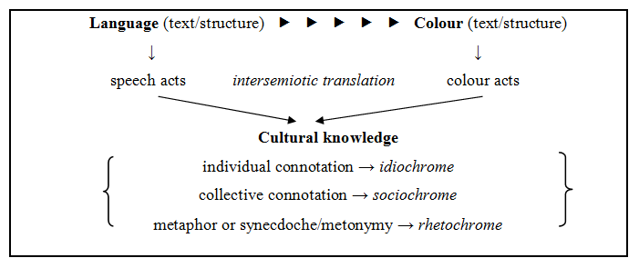
Schema 1: Schema of the intersemiotic translation between language and colour and the influence of cultural knowledge.
I believe that intersemiotic translation between the verbal and chromatic semiotic systems is feasible when colour has been defined as knowledge in cultural terms (idiochrome, sociochrome, rhetochrome), but first and foremost because colour is a text with a structure and function. I agree with Flosch’s and Thürlemann’s observation that it exists a double layer of signification in picture, and more precisely that “[o]n the iconic level, the picture is supposed to stand for some object recognizable from the ordinary perceptual Lifeworld; while concurrently on the plastic level, simple qualities of the pictorial Expression serve to convey abstract concepts” (Sonesson 1993: 325). However, I feel that this problem of conveying abstract concepts can be overcome since in intersemiotic translation, the other semiotic system involved, in our case language, leads the translation onto safer paths. We have to remember that “[l]anguage is an evolutionary latecomer that functions as an economizing grid which cultures have superimposed on nonverbal semiosis for communicative efficiency” and that “[t]ranslation is one of the fields of study where the fault lines between these signification systems become visible” (Ruthrof 2003: 79).
The informational loss may be greater if in an intersemiotic translation with language, colour functions as an idiochrome, although I could claim the same if its function is that of a sociochrome, since cultural knowledge may be recorded but not widespread in everyday communication. The informational loss seems to be minimised when the intersemiotic translation between language and colour is at the rhetorical level, colour in this case functions as a rhetochrome.
6. Conclusions
The intersemiotic translation between language and colour seems to be possible under two main restrictions. The first one is that it is not an ambidextrous process. While starting from the language, the dominant semiotic system for many semioticians, the social interpretation and identification of colour is possible, but it seems very difficult for a codified iconic system (as colour is) to be the source text, and to be translated to natural language (target text), due to the great number of associations which a colour has. The relation is that of the general to the particular, it is that of the many over the one.
The second one is that the degree of socio-cultural knowledge for the colour, since, as Greimas and Courtés (1993: 77) mention that “[f]rom a semiotic point of view, the concept of culture could be approached as coexisting with that of the semantic universe, in relation to a given sociosemiotic community”. This mention to a given sociosemiotic community also justifies the role of the translator, who is not just a mediator, but a cultural mediator, that does not have a limited access, but ample socio-cultural knowledge which is also necessary for any intersemiotic translation, much more when the target text is in colour.
References
ALMALECH, Mony. 2011. Advertisements: signs of femininity and their corresponding color meanings. Sofia: Prof. Marin Drinov Academic Publishing House.
BARTHES, Roland. 1964. La rhétorique de l’image. Communications 4. 40–51.
BARTHES, Roland. 1964b. Eléments de Sémiologie. Communications 4. 91–135.
CAIVANO, Jose Luis. 1996. Color theory as a contribution to visual semiotics. In Irmengard Rauch & Gerald F. Carr (eds.), Semiotics around the World: Synthesis in Diversity, volume 2, 685–688. Berlin: Mouton de Gruyter.
CAIVANO, Jose Louis & Mabel Amanda López. 2006. Can color be an antiglobalization factor? Analysis of colors in branding. In Proceedings of the Interim Meeting of the International Colour Association ‘Colour in Fashion and Colour in Culture’, 24–27 October 2006, 13–18. Johannesburgo: McGraw-Hill Books.
GREIMAS, Algirdas & Joseph Courtés. 1993. Sémiotique. Dictionnaire Raisonné de la Théorie du Langage. Paris: Hachette.
DEELY, John 2002. What Distinguishes Human Understanding? South Bend: St. Augustine’s Press.
ECO, Umberto 1979. A Theory of Semiotics. Bloomington: Midland Book Edition.
EDELINE, Francis. 2010. La plasticité des catégories (2. Le cas de la couleur). In Michel Constantini (dir.), La sémiotique visuelle: nouveaux paradigmes, 205–224. Paris: L’Harmattan.
FABBRI, Paolo. 2008 [1998]. Le tournant sémiotique. Paris: Lavoisier.
GROUPE μ. 1992. Traité du signe visuel. Pour une rhétorique de l'image. Paris: Seuil
GROUPE μ. 1995. A rhetoric of visual statements. In Thomas-Albert Sebeok and Donna Jean Umiker-Sebeok, Advances in visual semiotics: the semiotic web 1992–93, 581–599. Berlin/New York: Mouton de Gruyter.
JAKOBSON, Roman. 2004 [1959]. On linguistic aspects of translation. In Lawrence Venuti (ed.), The Translation Studies Reader, 138–143. New York and London: Routledge.
KLINKENBERG, Jean Michel. 1996. Précis de sémiotique générale. Bruxelles: De Boeck.
KRESS, Gunther & Theo van Leeuwen. 1996. Reading Images: The Grammar of Visual Design. New York: Routledge.
KRESS, Gunther & Theo van Leeuwen. 2002. Colour as a semiotic mode: notes for a grammar of colour. Visual Communication 1(3). 343–368.
LOTMAN, Yuri & Aleksander Pjatigorskij. 1969. Le texte et la fonction. Semiotica 1. 205–217.
LOTMAN, Yuri. 2009 [1992]. Culture and Explosion. Trans. W. Clark, Berlin: Mouton de Guyter.
NÖTH, Winfried. 2012. Translation and semiotic mediation. Sign Systems Studies 40(3). 279–298.
PASTOUREAU, Michel. 2001. Bleue: the History of a Color. Princeton: Princeton University Press.
PASTOUREAU, Michel. 2009. Black: the history of a color. Princeton: Princeton University Press.
PETRILLI, Susan. 2003. Translation and Semiosis. Introduction. In Susan Petrilli (ed.), Translation, Translation, 17–37. Amsterdam & New York: Rodopi.
RUTHROF, Horst (2003). Translation from the Perspective of Corporeal Semantics. In Susan Petrilli (ed.), Translation, Translation, 69–86. Amsterdam & New York: Rodopi.
SAINT-MARTIN, Ferdinand. 2000. Semiotics of visual language. Bloomington: Indiana University Press.
SONESSON, Göran. 1993. Pictorial semiotics, gestalt theory, and the ecology of perception. Semiotica 99(3). 319–399.
SONESSON, Göran. 1998. The concept of text in cultural semiotics. Sign Systems Studies 26. 81–114.
STERN, Steve. 2010. Reckoning with Pinochet: The Memory Question in Democratic Chile, 1989–2006. Durham: Duke University Press.
TOPOROV, Vladimir. 1992. Translation: Sub Specie of Culture. Meta 37(1). 29–49.
TOROP, Peeter. 2002. Translation as translating as culture. Sign System Studies 30(2). 593–605.
TOROP, Peeter. 2008. Translation and Semiotics. Sign Systems Studies 36(2). 253-257.
TOROP, Peeter. 2014. Culture and translation. In Valter Lang and Kalevi Kull (eds.), Estonian Approaches to Culture Theory. Approaches to Culture Theory 4, 36-63. Tartu: Tartu University Press.
VAN LEEUWEN, Theo. 2011. The Language of Colour. An Introduction. London and New York: Routledge.
WHITBREAD, David. 2009. The Design Manual. Sydney: University of New South Wales Press.
[1] As Sonesson (1998: 83) states “[the text] may also be described as that which is (should or could be) subject to interpretation”.
[2] Van Leeuwen (2011: 49) mentions that “[…] colour has a range of dimensions, not just value and saturation, but also luminosity and luminescence, luster, transparency and temperature—even aspects of texture such as roughness or smoothness, or wetness and dryness can directly influence the way colours are understood and named”.
[3] Lotman (2009 [1992]: 115) mentions that “[c]ontemporary semiotic study also considers text as one of the basic research concepts, but text itself is considered as a functional rather than a stable object with constant properties”.
[4] Klinkenberg interestingly approaches the matter from the perspective of redundancy. For Klinkenberg (1996: 59), redundancy may be created through different codes (intercodic) and different channels. He mentions the notion of ‘a hundred francs’ as an example, which can be expressed with the references /a hundred/ and /francs/ on the banknote or with colour.
[5] Thus, for Klinkenberg (1996: 290), colour is articulated in minor units which he names chromèmes characterised by chromatic dominance, luminosity and saturation.
[6] For Caivano and López (2006: 16), “[…] red is the preferred colour for products of massive consumption, because it is regarded as a “declassifier”, i.e., a colour that does not contain markers of class. Another similar phenomenon is the case of McDonalds”.
[7] Almalech (2011: 21) seems to stress the importance of the symbolic rather than the indexical meaning of colour.
