LOGOTYPE AND NARRATIVE
New Bulgarian University, Sofia, Bulgaria
rstefanova@nbu.bg
Abstract
The aim of this study is show the semiotic perspective on the denotative and connotative aspects and pathways, including the concept, analysis, design and logo reproduction of a series of elements, which is one of the most challenging and complex tasks for graphic designers. The creation of a bright, recognizable and memorable logo is a difficult project, often requiring multiple recombinations and redesigns to recreate the maximum expressiveness while keeping a certain lightness and elegance. The creative process in creating a particular sign – logo, includes a number of time-consuming stages, mostly in conceptual, creative and narrative plan. The final result incorporates a combination of different graphic elements that express the original idea of the author-artist as a series of stories or narratives: what will the character serve for (including its target group), what provokes at first glance (recognition), the subject of its expressiveness, its form and size (graphic particularities and requirements), etc. All this wide range of features makes logos an extensive semiotic material for analysis and research, which promotes positive understanding of the entire creative process from a different perspective, including the perspective of the graphic designer.
1. Introduction
A narrative is a term, which in its loosest sense in literature is used to define in short a story.Bulgarian literature often uses the term нарация ‘narration’. The term narrative in a semiotic context has a broader definition and is used to describe a series of events that are logically related in temporal and causal way or discourse, which is based on some form of a story.
The purpose of this study is to cast a semiotic perspective (Peirce 1931–1958) on the denotative and connotative aspects and pathways, of which the conceptual design, the analysis, the design, and their synthesizing into the logotype production in a series of elements, which is one of the most challenging and complex task for graphic designers. The creation of a bright, recognizable and at the same time memorable character is a difficult project (Rastie 2004), often requiring multiple recombinations to recreate and design maximum expressiveness while keeping a certainlightness and elegance (Gruev 2009).
The creative process in designing a particular sign – logotype[1], includes a number of stages in time, but mostly on the conceptual, creative narrative level (Parker 2004). The final result is a combination of many different graphic elements that express the concept of the author-artist, as a manifestation of a series of stories or narratives: what will the character serve for (its target group of users), what is the first glance impression (recognition), what is the subject of its expressiveness, its form and size (graphic particularities and requirements), etc. The listed range of features makes logotypes an extensive semiotic material for analysis and research that promotes positive understanding of the entire creative process from a different perspective, even the one of the very graphic designer.
The study sets the following goals:
· Defining of the notion logo and its characteristics;
· Semiotic aspects in the stages of the designing process of a logotype.
2. Defining of the notion logotype and its characteristics
The term logotype has Greek roots (Λόγος ‘word’ + τύπος ‘imprint’) and refers to the printed symbol or mark/brand symbol of a company. As a brand symbol the logo is a trademark that is used as an identifier of a given company. It depicts a graphic representation of stylized letters, signs or combined elements (letters and signs).
When the mark has no text, it is essentially a symbol. Those used for communication (index signs) are called pictograms, pictographs.
The marks only made out of text are typographical and they may be comprised of letters, words or monograms (initials, abbreviations or words, company names).
Combinative marks incorporate together texts and characters.
When the mark is registered and protected by the law, it becomes a trademark.
A successful logo is a matter of balancing its many details (McWade 2007a). It must, however, meet a number of criteria:
· to be simple and elegant – an image with fewer elements is more powerful;
· to feel substantial and to look solid – not too much thin lines unrecognizable in scaling (a logo needs to be identical when scaled down or up – without interlocking lines);
· to correspond to its purpose;
· to be visually different – it should not refer to or remind us of already established brands.
There are a number of characteristics that are associated with the graphic rules when creating the logo (McWade 2007b). The main recommendations are the following:
· to use graphical networks in its building;
· to be able to translate circles and ellipses into a logo is great, because these graphical objects serve as easily recognizable focal points;
· not to use intrusive fonts;
· to avoid too high or too wide logos (follow the golden ratio or the ratio of 3: 2);
· to integrate the sign and the name into one since they belong together.
The process of designing a logo contains four steps:
A. Selecting a suitable dingbat[2] – after a conversion to vector tracks, they can easily be broken down into constituent elements and then converted and resized in different forms.
B. Adding a background field.
C. Modifying or transforming.
D. Completing the process, adding a name.
A. Deciding on a shape. According to what they represent, there are three types of logos:
1. Illustrative (iconic) – graphic images of objects.
2. Symbolic – graphic images of already familiar symbols.
3. Abstract – graphic images, disconnected from reality, implying a thought, concept, idea. These types of logos are used most often when a specific objective is a physically intangible activity or object. Also, when the company is diverse in agendas or projecting future diverse activities. Abstract logos are used when it is desired to impose a suggestion of strength, success, partnership and others intangible qualities. Dingbats are often carriers of such forms.
Very often the same forms suggest different things. Sometimes the goal is to recreate in abstract forms actual physical properties of an object – for example, a circular composition of leaves can mean either circular composition of leaves or symbolically to inspire teamwork, togetherness, cooperation (Romanicheva and Yatsyuk 2000). If the logo is accompanied by text, then it is easy to interpret its meaning.
A. The role of the background – this is the stage that helps the logo:
· to become more solid looking;
· to have a more appealing form;
· to smoothen its edges;
· to strengthen the logo’s colors;
· to create a sort of a dynamic tension.
The rules are of particular importance in formulations with uneven outer contour and many sharp edges as well as in the figures of irregular shape.
The simple shapes are circle, ellipse, square and hexagon that easily focus the viewer's attention. More complex ones are the rectangle, the triangle, the polygons and a very flattened ellipse, where the energy is dissipated and distracted.
It is easy and attractive to use a negative image and energetic forms. Darker backgrounds suit lighter symbols well. Sometimes this leads to a dramatic effect. Dynamic tension and movement is created by an eccentric placement of a standard shape when rotated. In the end it is most important that the background and the image are well related (Mikhailov 2007).
A. Modification or transformation – conversion of simple forms.
It is best for the already produced symbol to be broken down to its individual parts and reorganized – the components are to be rearranged with one another, some deleted completely, others rotated, etc. Another way is to repose the constituent elements relative to one another in a different order or direction. Another approach is to add two or three dingbats, using parts of the shapes or the entire shape to be duplicated and replaced in a cascade fashion.
B. Adding the name of the company.
The company’s name transforms a logo in the company logo. It appears esthetically pleasing when it is unobtrusive and minimal. The aligning is done by following sharp contours or axes to the logo. The width is matched to that of the logo, which is achieved after an appropriate transformation and use of the graphical networks. Uppercase letters and bold are appropriate. According to the purpose of the trademark, for example, when there are large objects, the text may dominate the logo, which is important in order to focus on working with the appropriate font and font size. It is necessary to align the graphic character to the text in accordance to strict rules and starting points.
3. Semiotic aspects in the stages of the creative process of logo building
Reflecting on a narrative as a manifestation of structuralism, I follow a theory in particular, i.e. the narrative semiotics of Greimas[3] (narrative grammar), and the idea of unlimited semiosis by Umberto Eco (Eco 1993a, 1993b, 1998). According to Eco, the process of infinite semiosis as a system of commutations of reference from sign to sign is a prerequisite for communication (Eco 1997). The logotype as a sign is a collective image for communication, as a recurring element of TOTAL-design in the presentation of a company, organization or association. Therefore, in itself it combines a variety of functions.
The narrative grammar of Greimas studies four levels in semiotic knowledge, focusing primarily on the more abstract of them (Bankov 2004). Applied semiotics is the second level, where, alongside the natural sciences, film, theater, etc., are interpreted on the basis of knowledge from the first level, which studies natural languages. Here is the place of the case in question – the research on the narratives of the logotype. The methodological (the more abstract) and epistemological level are 3rd and 4th in this order, which ensure the scientific perfection of the system of Greimas, described in detail in the Encyclopedic Dictionary of the theory of language, co-authored with Cortes[4]. According to prof. Bankov, Greimas's most important ambition is of creating “да даде универсална граматика на смисъла или, с други думи, формалните условия на процесите на означаване” [universal grammar to give meaning or, in other words, the formal terms of the process of signification] (Bankov 2001). He argues that meaning is not static but evolves from simpler (abstract) structures to more complex and concrete ones through which at the end comes the text. On one hand we have the skeleton of signification (semio-narrative structures), on the other – filling the skeleton with figurative elements (discursive structures) involved in the generation of meaning. The semio-narrative structures comprise of two levels: deep – fundamental syntax (semiotic square – figure 1) and surface – narrative syntax (Bankov 2001).
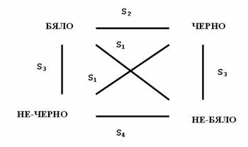
Fig. 1: Semiotic square, incorporating positions of opposition,complementarities, contradictory and sub-contradictory[5].
Each entity acquires real dimensions to denote and mean at a particular moment of time after an analysis following the logic of the semiotic square (Kassabov 2006), the surface -narrative syntax (the actants of Greimas from the narrative program) further enriched with figurative elements of communication (discourse). The structuralist approaches seeks to explain processes and phenomena of life that have little in common between them. The idea of the narrative program of Greimas (comprised of qualification, performance and sanction) is not to give rules, but to identify the mechanisms which establish the significance on the level of the narrative. Along the lines of this reasoning I analyze the logotype as a manifestation of the narrative discourse.
The actants are difficult to fit in the analysis of any logotype, i.e. narrative syntax has no way of implementing when the final version of the logo is made accidentally (a common thing to happen with numerous examples from everyday life and practice). It is a sign of real mastership for the projects to be achieved through the design process. In those cases the actants composing elements (consistently integrated elements of logos in a particular place) play a crucial role in understanding the purpose and meaning of the sign (the meaningful object in the narrative syntax[6]). On the other hand, the story concentrated in the logo reflects to a great extent the dynamics covering its conceptual design, its foreseen purpose and its use, which is a mandatory moment of design. The techniques for implying suggestions are distinct just as the means employed. The in depth – fundamental syntax is the strong side of semiotic analysis here, which then immediately is deployed in an appropriate figurative discourse – the particular image. The logo without a text is often unclear and heterogeneously indexed. The mastery is in the simple but expressive forms without ambiguous messages in the conventions. This would be achieved always, if one is to follow the above mentioned semiotic approaches to the preliminary analysis of each logo.
Very often the conventions of reading logos are intertwined, confirming its complex nature. When there is only one character, most often it refers to familiar symbols of everyday life. When a text is added, the characters become easily recognizable. The mastery is in simple forms that are very appealing to the eye, but extremely difficult to achieve for the graphic designer. Worldwide classics in creating such perfect shapes are just a few. Fortunately, on our local stage we have such a master craftsman – the artist-painter Stefan Kanchev. His work is remarkable and renowned on a large international scale. In 1994 Stefan Kanchev was recognized as one of the top ten best masters of logo design in the world and joined the renowned Paul Rand, Milton Glaser and Sol Vas[7]. His prize was awarded by the International Centre for trademarked logos ITC in Ostend, Belgium. figure 2 illustrates the personal monogram of Stefan Kanchev, which is beautiful and expressive and yet perfectly simple. It intertwines the initials of the author as C and K, as well as an open eye, illustrating the affiliation of the author as an artist and an artist in the visual arts (Stancheva 2011).
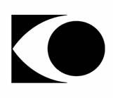
Fig. 2: Monogram by Stefan Kanchev[8].
The projects of Stefan Kanchev are light and delicate, elegant and memorable. A few generations of Bulgarians have grown up surrounded by his characters in everyday life (figure 3).
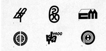
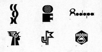
Fig. 3: Logos for trademarked companies and brands by Stefan Kanchev[9].
Figure 4 illustrates the logo of the Bulgarian Government business enterprise company Petrolfrom 1969, created by Stefan Kanchev (now – Petrol stations). Its job description brand includes: a beast with a built-in Latin letter P and elements of movement and combustion.

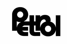
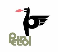
Fig. 4: Brand Petrol by Stefan Kanchev (sign text and combined sign)[10].
Figures 5 and 6 illustrate the elements of the debating club’s logo at New Bulgarian University, which appear to be similar to the actants in a narrative construction. This is a student project which is semantically insightful, well-built and well-presented. The author Peter Nikolov combined the logo of New Bulgarian University, a microphone and two speakers behind grandstands, which summarizes the design idea of the logo: Debating at New Bulgarian University.

Fig. 5: Elements in the logo of a debate club at New Bulgarian University (project)[11].
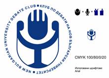

Fig. 6: Design of a logo of the debate club at NBU. Author – Peter Nickolov[12].
There are two more student logos – of a publishing house (figure 7) and a winery (figure 8). Both brands are also sufficiently expressive and abiding of semiotic principles of building. In the version of the publishing house, representing a combination of an ideogram and typography, the following ideas are intertwined: land (a circle crossed by a horizontal and vertical line), a cross (a sign of rich symbolism: an expression of spirituality and materiality, represented by the horizontal line – femininity, and the vertical line – male /phallic, associated with the Sun, the solar circuit), and Enso (a circle painted with a brush in Zen Buddhism freely expressing the current awareness of the painter). The interesting thing here is that the name of the company brings the idea of unexplored space as well as ideas presented by the publisher – terra incognita (a strange/unexplored land). It is trendy to place a slogan (motto) to the logo, as you can see in figure 7.
Fig. 7: Logo of publishing house Terra Incognita.Author – Stoyan Atanasov, New Bulgarian University[13].
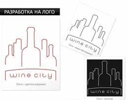
Fig. 8: Design of a winery logo.Author – Iskra Sabcheva, New Bulgarian University[14].
The project for the winery incorporates as actants the idea of a city built from wine bottles, supported by the text – wine city (the city of wine).
One of the best and most recognized contemporary creators of logos in the world Rand Paul gives several important principles and rules for creating a quality sign[15]:
· The meaning of the logotype is determined by the contents of the illustrated object - trademark, company, etc., and not the other way around.
· The content of the logotype does not need to match the scope of activities that it represents – it is essential to be clear, distinctive and memorable.
· The presentation of each new idea in the form of a logotype to the client is one of the most difficult tasks for the graphic designer to make successfully adopted and implemented.
· The simplicity of the sign is not the main goal. It is the result achieved by a revolutionary design and sensible analysis (figure 9).
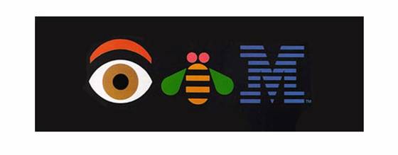
Fig. 9: Poster for IBM by Paul Rand, 1970[16]
Figure 10 shows a selection of the best logos, arranged according to the magazine Graphic Design USA. Their creators were Paul Rand, Milton Glaser, Massimo Wine and other leading contemporary graphic designers (Yong 2013).
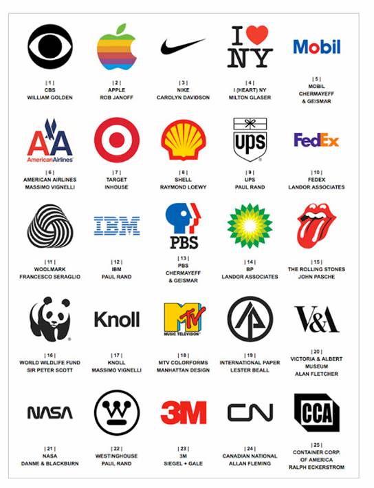
Fig. 10: Selection of the favorite logos from the past half century,according to the magazine Graphic Design USA, published in 2013[17].
4. In conclusion
The present article follows the basic rules in building a logotype and its semiotic reflection and interpretation. The narrative semiotics of Greimas, which includes the generative transition of meaning and is intended to carry on the formal method in the study, both in speech activity and on every possible denotative practice helped me to illustrate stages in the constructive process of creating a logotype. The objective is not for graphic designer to delve into semiotic debriefings, but rather on the basis of the presented semiotic discourse to reveal its ideological force in the syntax of the completed form, to face the need for a preliminary structure of elements that makes up the final product, in such a way that it is in a best way possible received by the recipient – the communicator in the overall process of communication and communication through signs and trademarks.
Via analyzing their work in a semiotic fashion and applying this method, even commonplace artists may be successful. The semiotic approach to design is a skillful and punctual tool for creating successful logos and signs, which once again confirms the strength of applied semiotics as an interdisciplinary branch of science.
Bibliography
BANKOV, Christian. 2004. Семиотични тетрадки, част II: Семиотика, памет, идентичност. [Semiotic notebooks, part II: Semiotics, memory, identity.] Sofia: New Bulgarian University. ISBN 9545353325.
BANKOV, Christian. 2001. Семиотични тетрадки, част I: Уводни лекции по семиотика.[Semiotic notebooks, part I: Introductory lectures on semiotics.] Sofia: New Bulgarian University. ISBN 9545352507 (part I).
ECO, Umberto. 1993а. Семиотика и философия на езика. [Semiotics and the Philosophy of Language] Sofia: Nauka i Izkustvo. ISBN 9540201365.
ECO, Umberto. 1993б. Трактат по обща семиотика. [Tractate on general semiotics] Sofia: Nauka i Izkustvo. ISBN 9540200849.
ECO, Umberto. 1997. Интерпретация и свръхинтерпретация. [Interpretation and Overinterpretation] Sofia: Nauka i Izkustvo. ISBN 9540202256.
ECO, Umberto. 1998. Отсутствующая структура. Введение в семиологию. [Absence of structure. Introduction to semiology.] Translated by A. G.Pogonyaylo and VG Resnick, Editor– M.G. ERMAKOVA, TOO TK Petropolis. ISBN 5-86708-114-1. http://georgesg.info/belb/obmen/otsutstvuyuwaya_struktura.pdf (accessed: 02 May 2014)
GRUEV, Stoyan. 2009. РЕвизия. [REvision] Sofia: NAA.
KASSABOV, Ivan. 2006. Граматика на семантиката. [Grammar of semantics.] Sofia: St. Kliment Ohridski.
MCWADE, John. 2007a. Професионален дизайн на бизнес материали.[Before&After Graphics for Business]. Translated by Vasil Sirmanov, Sofia: SoftPres. ISBN: 9789546854926
MCWADE, John. 2007b. Професионален дизайн на печатни материали. [Befor and after page design]. Translated by Vasil Sirmanov, Sofia: SoftPres. ISBN: 9789546854766
MIKHAILOV, Ivelin. 2007. Наръчник по предпечатна подготовка. [Manual prepress.] Sofia: Asenevtsi, ISBN: 9789549167092.
PARKER, Roger. 2004. Професионален дизайн в рекламата. [Professional design inadvertising]. Sofia: SoftPres. ISBN: 9546850780
PEIRCE, Charles Sanders. 1931-1958. Collected papers, Edited by Charles HARTSHORNE and Paul WEISS. Vols. 7-8 edited by A.W. Burks. Cambridge: Belknap Press of Harvard University Press, 1958-1966.
RASTIE, Francois. 2004. Знаци и изкуства. Семантика и семиотика. [Signs and arts. Semantics and semiotics.] Shumen: Publishing house “St. Konstantin Preslavski”. ISBN 9549158527.
ROMANICHEVA E. O. YATSYUK. 2000. Дизайн и реклама. Компьютерные технологии:Справочное и практическое руководство. [Design and advertising. Computer Technology: A Practical Guide and Reference]. Moscow: DMK. ISBN 5898180346.
STANCHEVA, Magdalene. 2011. Анонимният известен. [Anonymous known.] Plovdiv: PC Janet 45. ISBN 9789544917500.
YONG, John. 2013. Favorite Logos Of The Past Half Century,http://designtaxi.com/news/356821/Favorite-Logos-Of-The-Past-Half-Century/?interstital_shown=1, (last accessed: 1 September 2014).
Internet resources
4 principles by Paul Rand that may surprise you. 2014. http://99designs.com/designer-blog/2012/09/04/4-principles-by-paul-rand-that-may-surprise-you/, (last accessed: 18 September 2014).
Stefan Kanchev (1915-2001). 2013. http://stefankanchev.com/biography.html, (last accessed: 11December 2014).
Another person for a smarter planet. 2014. http://eamesdesigns.com/eames-spotting-article/building-a-smarter-planet/, (last accessed: 30 November 2014).
Dictionaries used
BUROV, Stojan and others. 2008. Съвременен тълковен речник на българския език с приложения. [A Dictionary of Bulgarian language applications.]. Veliko Tarnovo: Gaberov.ISBN: 9789549607135
DOBREV, Dobrin & Elka DOBREVA. 1994. Справочник на семиотичните термини.[Directory of semiotic terms.]. Shumen: Glauks. ISBN 9548164027.
KASSABOV, Ivan & Krasimir SIMEONOV. 1999. Универсален енциклопедичен речник. Том I.[Universal encyclopedic dictionary. Volume 1.]. Sofia: Publishing house Svidas. ISBN9549044610 (т.1)
KASSABOV, Ivan & Krassimir SIMEONOV. 2003. Универсален енциклопедичен речник. ТомII. [Universal encyclopedic dictionary. Volume 2.]. Sofia: Publishing house Svidas.
KOLAPIETRO, Vincent. 2000. Речник по семиотика. [Dictionary of Semiotics.]. Translation of Ivan Mladenov, ed. Emilia Pishtalova. Sofia: Hazel. ISBN 9548283344
MARTIN B. & F. RINGHEM. 2010. Словарь семиотики. [Dictionary of Semiotics]. Translationof D. Sichinava. Moscow: Book house LIBRIKOM.
STOICHKOVA, Sonia. 2008. Речник на терминологията в графичното изкуство. [Glossary of terminology in the graphic arts.] Sofia: Old Street. ISBN 9789549188424.
[1] Logo - in Bulgarian language is also used the term logos, which transfer is a trademark or symbol, often created on the basis of letters (Stoichkova 2008).
[2] Dingbat is graphic ornamental sign. Most often these are the list markers - bullets (star, hand, etc.) (author's note).
[3] Algirdas Julien Greimas - one of the most important French semiotics, founder of the Paris School of Semiotics, linguist, folklorist and literary critic, creator of the program narrative and aktantniya analysis. (author's note)
[4] Sémiotique, Dictionnaire raisonné de la théorie du langage, A.J.Greimas , J.Courtès, Paris, Hachette, 1979.
[5] Bankov, Christian. 2001. Семиотични тетрадки, част I: Уводни лекции по семиотика. [Semiotic notebooks, part I: Introductory lectures on semiotics.] Sofia: New Bulgarian University. ISBN 9545352507 (part I)
[6] Value object - an element of the level of narrative syntax associated with the motivation of actants. (author's note).
[7] Paul Rand, Milton Glaser and Soul Vas - three world-renowned masters in graphic design. (author's note)
[8] http://stefankanchev.com/biography.html
[9] http://stefankanchev.com/biography.html
[10] http://stefankanchev.com/biography.html
[11] Personal archive of the author.
[12] Personal archive of the author.
[13] Personal archive of the author.
[14] Personal archive of the author.
[15] http://99designs.com/designer-blog/2012/09/04/4-principles-by-paul-rand-that-may-surprise-you
[16] http://eamesdesigns.com/eames-spotting-article/building-a-smarter-planet/
[17] http://designtaxi.com/news/356821/Favorite-Logos-Of-The-Past-Half-Century/?interstital_shown=1
