ADVERTISING TOOLS AND TECHNIQUES APPROPRIATED TO CONSTRUCT THE GLOBAL BRAND MR. CLEAN
Ryerson University, Toronto, Canada
“Advertising is the greatest art form of the 20th century.”
Marshall McLuhan. Ad.age. Sep. 3, 1976.
Abstract
As a knowledge worker for over twenty-five years in the advertising system, I created branded communications on behalf of corporations. Using my marketing experience coupled with research into techniques and methods appropriated by the advertising industry I will demonstrate how the creators of brand messaging use advertising tools & techniques to express branded concepts.
In this paper I will examine how and why brand meaning is constructed and shared through the appropriation of advertising tools and techniques in contemporary messaging. First, I will define the concept of “brand”, and its significance. Here, I intend to measure significance in light of the capitalist system (in which it is regulated) characteristic elements. Then I will describe semiotic theory to demonstrate how it can be applied to branded advertising messages. After presenting a history of the Proctor and Gamble manufactured Mr. Clean brand, I will expound the tools and techniques applied to create this global commodity, and how these delivery systems provide the product brand meaning, through signs broadcast to consumers by way of: logos, packaging and advertising messages transmitted through mass media. Thus leading to an increase of sales, that is integral for corporations to grow within the capitalist system.
1. Introduction
As a knowledge worker for over twenty-five years in the advertising system, I created branded communications on behalf of corporations. Using my marketing experience coupled with researchinto techniques and methods appropriated by the advertising industry I will demonstrate how the creators of brand messaging use advertising tools & techniques to express branded concepts.
In this paper I will examine how and why brand meaning is constructed and shared through the appropriation of advertising tools and techniques in contemporary messaging. First, I will define the concept of “brand”, and its significance. Here, I intend to measure significance in light of the capitalist system (in which it is regulated) characteristic elements. Then I will describe semiotic theory to demonstrate how it can be applied to branded advertising messages. After presenting a history of the Proctor and Gamble manufactured Mr. Clean brand, I will expound the tools and techniques applied to create this global commodity, and how these delivery systems provide the product brand meaning, through signs broadcast to consumers by way of: logos, packaging and advertising messages transmitted through mass media. Thus leading to an increase of sales, that is integral for corporations to grow within the capitalist system.
1.1 The brand
In their 1988 dictionary of marketing terms the American Marketing Association (AMA) defined the concept of a brand “a name, term, sign, symbol, design or some combination of these elements, intended to identify the goods and services of one seller or group of sellers to differentiate them from those of competitors”(Bennett, 1988). Contemporaneously a brand is seen as more than just an identity system. A brand can also be a complex system of interrelated management decisions and consumer reactions that create awareness, visibility and meaning of a commodity product. The process of branding may include the look of the packaging, the typeface of the package and advertising, packaging and advertising design concept and language, as well as the content and form of the product itself.
Brands are effectively created and used by way of the application of various theories in the creation of a symbol or trademark to represent the brand and its brand personality to the consumer. Some theories appropriated in the creation of a brand logo or wordmark are Carl Dare’s seven contrasts of type; colour theory, and visual hierarchy. A technique applied after the wordmark is created is the creation of a brand character. Where a personality is developed for the brand by appropriating human characteristics, so that the consumer will consider the brand as a friend with whom they trust. The personality is expressed by the following tools: wordmark, logo, advertising and shopper marketing. So that, every time the consumer comes in contact with the brand through any media or environment, the personality of the brand will be experienced. These brand marketing techniques are practiced in the developed, and developing world, assisting corporations in capturing consumers through the narrative of storytelling. Expressing a story around a brand is a tool used in advertising in order to build consumer allegiance, leading to the customer constantly purchasing a specific brand. This marketing trend repeats the deeply rooted need of all humans to be entertained (Lury, 2004). Later on in this paper I will define and expand on the role of the narrative as an advertising tool, using Greimas’ actantial model.
Brands are measured in sales and in earning potential. A chart is created by global consultancy corporation Interbrand, who publish every year a brand’s perceived value. In 2013 Apple was the most world’s valuable brand, with a value of $98,316 m, and Pampers owned by Proctor & Gamble was in 29th place, this same company owns the household multipurpose cleaner: Mr. Clean (Interbrand). This perceived brand value is created through advertising tools and techniques such as: brand character, textuality, logo, typography, slogans, mnemonic devices, narratives, and can be analyzed using semiotic theory.
1.2 Semiotics
Semiotician Umberto Echo states that “semiotics is concerned with everything that can be taken as a sign” (Eco, 1979, p.7) and also suggests that signs are everywhere, and they consist of: slogans, typography, body language, clothes, images, colour etc.
Semiotics is an important area of study, and its theories can be applied to communication. With many media channels broadcasting over 5,000 messages a day to the typical urban consumer (Walker-Smith), the studies and observations of theorist Roland Barthes are very important when applied to messaging that is broadcast through mass media. As discussed in his book Mythologies, Barthes’ application of signifier + signified = sign to advertising can bring insights into symbolic messaging applied to global brands such as Marlborough and Coca Cola. Barthes demonstrates how these are instrumental in exporting capitalism to non-western nation states through globalization (Barthes, 1972, p.115).
Furthermore Marcel Danesi explains that a sign can consist of symbols, words, images and “the word sign is used in semiotics to encompass anything that stands for something other than itself”(Danesi, 2013, p.590). Danesi, a Professor of Semiotics at the University of Toronto is a leading semiotician believes that “brands are one of the most important modes of communication in the modern media environment” (Danesi, 2006, p.3). I will be applying both Barthes’ and Danesi’s semiotic observations to the advertising tools and techniques applied to the brand Mr. Clean.
1.3 History of Mr. Clean
As depicted in the AMC television cable show MADMEN, the 1950’s and 1960’s were known as the golden age of advertising. Corporations had been performing an “aggressive use of research and development in the postwar period to devise new and often quite useful consumer products; and the advent of television, which the advertising industry latched onto as a powerful mass-marketingTool” (Schnakenberg, 2000, p.2).
In 1958 the American consumer product giant, Procter & Gamble - known as P&G – decided to enter a growing “all purpose cleaner market” infusing the market with it’s own version, by first approaching a medium-sized Chicago based advertising agency: Tatham-Laird. The shop's creative director, Tom Cadden, was asked to come up with a brand name and a song, known in theadvertising business as a jingle. These are typical tools used by advertising agencies to create messages for mass media in the 1950’s and 60’s. In 1958 P&G launched “the product—and the character—(that) were unveiled to American consumers as Mr. Clean”. This brand name and advertising were designed to appeal to the target market of “married women who did not work outside the home” as it was discovered in research that “most husbands at the time rarely performed household chores” (Schnakenberg, 2000).
Richard Schnakenberg who wrote about Mr. Clean in the Encyclopaedia of Major Marketing Campaigns, observed that towards the end of the 1990s the Mr. Clean brand was used by “8.5 million households in the United States alone” and was distributed in 18 nation states. The brand character was recognized by other brand names where sold around the world; Mr. Propre (Germany, Austria, Switzerland, France, and Belgium); Maestro Lindo (Italy and Greece); Maestro Limpio (Mexico); Don Limpio (Spain and Portugal); and M. Net (French speaking Canada).
2. Tools & techniques
I will now define the tools & techniques that were appropriated by advertisers to give meaning to the brand Mr. Clean. This branded commodity is available in various cultures, and has one brand meaning expressed through different linguistic and visual signs. The advertising tools applied to semiotic theory are: Brand name, Brand character, Typography, Logo, Textuality, and the techniques are; Illustration, Mnemonic devices, Narratives, and Hero.
2.1. Advertising tools
Brand name.
In order for a brand to be marketed, a symbol or trademark is created to represent the uniqueness of the commodity product to the consumer, so that it is differentiated from other similar products. Once a brand has a self-identity expressed through its packaging, tools and techniques from the advertising industry are applied. This is to give meaning to individual branded commodities distributed within the capitalist system. The brand meaning is expressed through the agency of contemporary messaging that is broadcast by way of mass media, to reach a specific target market. So that every time the targeted consumer comes in contact with the brand through any media or environment, the personality of the brand will be experienced, through messaging created and produced through advertising and design agencies.
During the 1950’s research was performed on American housewives by P&G for the creation of an all-purpose household cleanser, and it was decided to position the household cleaner “as the perfect helper for harried homemakers.” To project this strategy it was decided to construct a linguistic solution by creating a name for the product, so the advertising agency studied mid century popular culture and noticed the widespread “Mister” trend. In the 1950s it was commonly used to personify a distinct attribute; “Milton Berle was known to be ‘Mr. Television’”; Stan Musial was “Mr. Baseball”; and Senator Robert Taft was “Mr. Republican.” So it followed that the master of household cleaning should be “Mr. Clean” (Schnakenberg, 2000, p.3). Brand naming is a strategy “designed to convey conceptual images associated with products through a suggestive name” (Danesi 2013, p.82). Therefore the prefix Mr. evokes images of: male, power, respect, safe and status. The word clean evokes the concepts: hygienic, tidy, pure, unsullied, the colour white. Therefore the name Mr. Clean conveys the linguistic signs of: male, power, status, respect, safe, pure, hygienic, and the colour white.
2.2. Brand Character.
Once the household-cleaning product acquired a brand name, the linguistic solution to an advertising problem has to be interpreted into a visual sign, in order to link the brand name with the products attributes of “power and strength” (Schnakenberg, 2000, p.4), and give a meaning to the brand name that cannot be misinterpreted by the consumer. Leading advertising practitioner, Rita Clifton describes in her book Brands and Branding that a brand character is a “visual symbol that has artistic quality while representing a clear commercial articulation of business strategy” (Clifton, 2003, p.119).
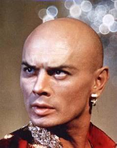
It was decided between Proctor & Gamble and Tatham-Laird to “create an association in consumers' minds between Mr. Clean and power and strength, the agency chose to depict him as a versatile muscle man” (Schnakenberg, 2000, p.4). It is very important in advertising to create a brand character for a product that is unique from it’s competition, and we use visual devices because “people can picture faces and images much more accurately and quickly than they can recall words” (Danesi, 2006, p.82). In the case of Mr. Clean the agency created an image of a brawny male and “the early drawings were loosely based on actor Yul Brynner and the genie character Djinn from ‘Aladdin's Lamp’ ” (Schnakenberg 2000, p.4). Yul Brynner was one of the most public figures during the mid 1950’s who had performed in The King and I on Broadway and won a Tony award, and then an Oscar in 1957 for reprising the same role in the filmed version (fig 1). Russian-born, American-based film and stage actor of Eurasian background, he was considered attractive, with his shaved head, that created a memorable image (Capua). He was in his mid-thirties while on performing on Broadway In The king and I and in the film version, Yul Brynner wore a ring in his left ear. This symbol was associated with genies that appeared in American culture and projected a magical exoticism, which was non-threatening to an American public. The 1940 British film The thief of Baghdad has a genie who grants wishes, and in the 1945 film A thousand and One nights a genie comes out of the bottle and helps win love.
. Figure 1. Figure 2.
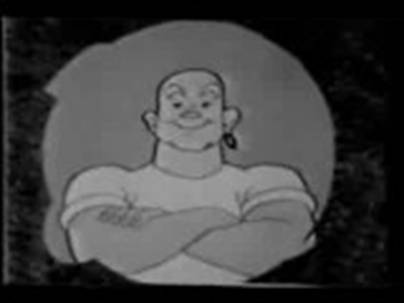
Brynner had a muscular body in The King and I, and this attribute was appropriated in the visual construction of the pictorial representation of the Mr. Clean Character. This was demonstrated through the hyper maleness that appeared on DC and Marvel comic superhero characters as demonstrated through emphasis on thick neck and large muscular arms. The fact that biceps are used to move the cleaning product around the surface to be cleaned, would demonstrate power in the act of cleaning, or, that Mr. Clean performed a lot of cleaning. Therefore displaying Mr. Clean with muscular arms (fig 2) would emphasis the product benefit to the viewer, and accomplish what the agency wanted of having the brand character perceived as an “all-time cleaning champ” a cleaning superhero for American house wives.
The agency then researched clothing, and explored a white garment that “represented an ex- sailor” (Schankenberg, 2000, p.4). It was perceived in US popular culture, that a sailor travels the world and visits many different ports. America had recently finished WWII and the imagery of the navy was seen in popular culture in South Pacific, both on Broadway in 1949, and on film during 1957 (IMB), also women were wearing sailor inspired clothing on the streets (Vintage). The United States media broadcast that it had won in its war against parts of Asia in WWII, bringing democracy to this troubled region. Mr. Clean represented the mixture of America and the exotic, which created a tension that made the character interesting to housewives.
The ad agency had to decide how to use clothing to emphasis the concept of power through the brand character. A long sleeved, white shirt would cover the muscular arms that conveyed strength, while a short, white t-shirt would enhance the strong arms, and still reflect the sign of the sailor that they were exploring during this design process. The colour white reflects purity and will display any speck of dirt on it’s surface, therefore if the t-shirt is white it has no dirt and is pure and hygienic. The visual device of a brawny male dressed in white clothing helped re-enforce the brand name Mr. Clean, who was a respectable male, strong, pure, hygienic, and presented the products attributes of power and strength to the targeted housewife.
As finally rendered, “Mr. Clean was a strapping bald man with slightly Asiatic features and a large hoop earring in his left ear” (Schankenberg, 2000, p.4). When the product was launched, the advertising down played the sailor story, and in research conducted after the launch, the consumer interpreted the visual brand character (fig 3) as “some sort of genie” (Schankenberg, 2000, p.4) without mentioning the sailor sign.
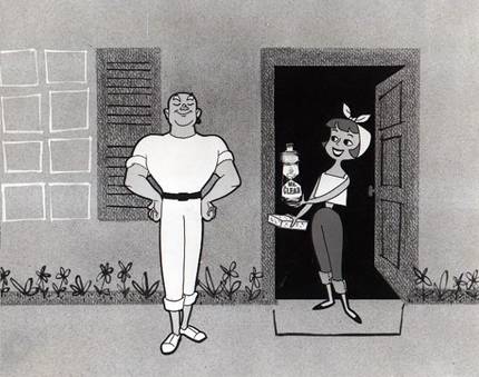
Fig 3. TV commercial late 1950’s. USA.
2.3. Typography
After a product has a brand name, and the brand character is visualized through a visual device, the next tool used by advertisers is Typography, to assist the brand name in projecting an image that the consumer will not confuse with another. The same effort placed into creating the brand image will now go into creating the Mr. Clean logotype, which is formed through; typeface selection; the arrangement of the letters M R C L E A N; and then applying two of Carl Dair’s (2012) theories; contrast of size; and contrast of colour.

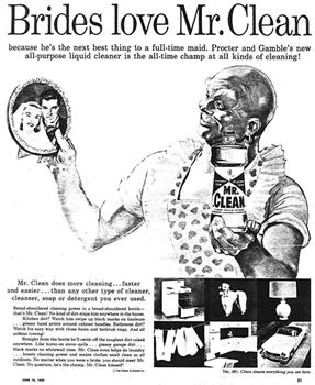
Fig 4. Fig 5.
The font selected in the original packaging (see fig 4) for the words Mr. Clean is a Sans Serifmeaning without serifs in English. A serif is a short line that is added to the main strokes of typefaces. This style of typeface used on the packaging is called Franklin Gothic Extra Condensed, and was a very popular font in the 1950’s. Its lack of serifs creates a clean line around the font, it appears uncomplicated without any thick or thin strokes. The typeface would have appeared very contemporary in the 1950’s, which re-enforces the launch of a new product that was the latest in home cleaning technology. Selecting a font that is not associated to another brand is very important, so that the brand name can have its own unique visual appeal. Applying Dair’s theory “Contrast of size”, one can notice how all of the letters on MR. CLEAN packaging are upper case, and the first letters M and C are slightly larger than R. L E A N, and they’re also “letter spaced” apart. The size difference re-enforces the hierarchy that the word CLEAN is more important than MR, and the first letters of each word have slightly more power than the rest. The largest letter is C, which “creates a focal point around which it is easy to organize the subordinate material” (Dair, 2012, p.55).
With Diar’s “Contrast of colour” (Dair, 2012, p.69-73), the letters are coloured in the warm spectrum that visually “move towards” the consumer, bringing the brand name directly at the consumers eye, and the “use of a second colour for contrast” which is yellow on the Mr. Clean packaging, complements the red lettering making it the main focal point on the package. The typography together with the red colour on a yellow background for the Mr. Clean brand is called a wordmark, which is a logo without a pictoral image.
2.4. Logo
For the last 100 years, marketing departments aim to give a branded product a meaning through the creation of visual and linguistic signs. It’s difficult to create a personality for a brand if it doesn’t have a name or logo. The Marketing division’s objective has always been “to get people to react to brands in ways that parallel how people respond to art and religious symbolism” (Danesi, 2006,p.60).
This can be accomplished through wordmarks and logos, which are “visual signs steeped in symbolism” (Danesi, 2006, p.54) and can be defined as “true symbols in the semiotic sense – signs standing for referents in culturally specific and historically meaningful ways” (Kress, 1996).
The wordmark of Mr. Clean is combined with the visual device of a bald, muscular, male character created for the brand, producing a logo that can be interpreted as a sign. Applying Barthes’ theory of “signifier + signified = sign” (Barthes, 1972, p.115) to this logo, can bring insights into the symbolic messaging. Therefore: Mr. Clean (signifier) + power (signified) = Mr. Clean is power (sign), and this is part of the strategic messaging that P&G wanted to transmit to the consumer.
The logo can also be considered a mini “text”. In semiotic terms the phrase text is the “putting together of signifying elements (words, sounds, images etc.) to produce a meaningful message”(Danesi, 1972, p.69). The text created in the Mr. Clean logo reflects the brand positioning of all-purpose cleaner that is the housewife’s perfect helper because of its power and strength. This is reflected through the combination of: typography; colour; male; shaven head; muscular arms; white shirt; and the addition of a golden earing that brings in the tension of American/exotic.
2.5. Textuality
As defined by Danesi in his book Brands “signification systems… are established through brand names and logos… constitute the ‘referential system’ upon which advertisers create ad texts todisplay them in various media (print, radio, television etc.). The form they are given in advertising campaigns can be called their ‘textuality’ ” (Danesi, 2006, p.70). I will now focus on how textuality was created for Mr. Clean in a 1958 TV commercial created the year the commodity was launched in the United States. (TV 1958).
The black and white TV ad opens with the words Mr. Clean written in dirt, which is removed to reveal the muscular, brand character, who is wiping the screen clean. Followed by images of soiled appliances and areas around a house, that are transformed “clean” by the animated character of Mr. Clean. The textuality of the commercial presents a white, muscular, male, removing all dirt, helping the housewife, whose face transmits the emotion of awe. The verbal part of the texts lists all of the surfaces he can clean including; walls, doors, windows, and kitchen appliances, which are demonstrated; six times in 60 seconds. The phrase “clean” is repeated verbally twenty times in 60 seconds. The housewife follows the brand character around the house, and by cleaning a mirror, he makes her beautiful reflection appear, inferring that by using Mr. Clean a housewife will be as beautiful as her clean home. (TV 1958) The cleanliness reflected through the verbal and non-verbal signs manufactures a tangible impression in the viewer’s consciousness, producing “indirect stimulation of a sensation (which) is known as ‘synesthesia’ ” (Danesi, 2006, p.71). “Synesthetic textuality” allows viewers to participate in the commercial as it stimulates neurological feelings to what they are seeing presented in the advertising. Semiotician Barthes in his 1977 book Image-Music-Text mentions that since synesthetic textuality permits viewers to become a “voyeur,” it arouses the senses by watching. It also transmits emotions through sensations that the brand activates in the brain in a believable manner (Barthes, 1977). The synthetic textuality of eliminating dirt with power, is turned into love as the housewife observes the muscular bald male annihilating grime, and stands enamoured next to him in the 1958 TV spot. Also Love is the outcome presented in the film The King and I starring Yul Bryner, where the female schoolteacher falls in love with the powerful, bald, king, who is fighting for his country.
3. Advertising techniques
I will now expand on the interpretations of the following advertising techniques applied to ‘signs’presented in the Mr. Clean messaging, broadcast through the mass media.
3.1 Illustration
After the Mr. Clean Logo had been conceptualized in 1957, the ad agency, Tatham-Laird’s art director had to decide how the brand character would be expressed as a visual device. There are many options available to an agency art director, who is responsible for the visual imagery that appears on packaging and advertising. In the case of Mr. Clean, the muscles, eyebrows, neck, and facial emotional state, can be manipulated to reproduce and broadcast the message in a clear undistorted form. This also allows for freedom in placing Mr. Clean in a variety of positions and situations, such as holding a happy baby (fig 6). Cameras and babies are a difficult match for an advertising photo shoot that cost thousands of dollars, and by illustrating the situation, the art director is guaranteed the results. The agency hired artist Richard Black to interpret the character in the technique of realistic illustration. Reproducing the brand character to appear on low-resolution analogue television, was solved by creating a simplified version of Black’s illustration style. This translated version consisted of a heavy black outline of the body, and a thinner black line presenting the facial characteristics such as the smile, eyes and eyebrows of a 38-year-old man (fig 3).
The illustration technique also allowed for layered images where the brand character can be expressed as non-threatening to the target market, by being placed with babies or wearing feminine articles. (Fig 5, 6)
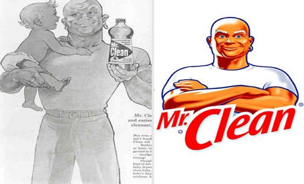
Fig 6. 1958 print ad. Fig 7. 2012 US logo.
The basic illustration style has been kept since Mr. Clean’s launch, and updated for todays consumer, however the basic elements of the highlight on the right side of the face, earing on left, white t-shirt, bushy eyebrows have been consistent over the last 57 years (fig 7). The highlight on the left hand side of the face emphasises brightness caused by the brand’s cleaning power. The artist who illustrated the original Mr. Clean, Richard Black, died April 1st 2014 in Ohio (Black).
3.2 Mnemonic devices
In the advertising field mnemonic devices are intended to assist the memory in remembering a brand and it’s benefits. They are part of an ad’s textuality, and are composed of verbal and non-verbal devices that can appear in any mass medium (Danesi, 2006, p.75). In Mr. Clean there are a number of devices the brand has appropriated and called its own, so that when the consumer is put in contact with these mnemonic signs, they will think of Mr. Clean. The brands verbal and non-verbal devices are: baldhead, muscular man, colour white, folded arms, lyrics, jingle, wordmark, and gleaming star.
The Yul Brynner reference became a mnemonic device for the household cleaner, after he became less popular with the general public. The only time the public would see a baldhead was when Mr. Clean was broadcast through mass media. During the 1970’s and 80’s mass media created icons such as Kojak, or Mr. T that have entered the public consciousness, but faded from public view after their popularity waned. However constant reminders through branded advertising messaging Mr. Clean has stayed top of mind. As it became fashionable among males in the 90’s to shave their heads, the public associated it first with Mr. Clean. This I know, as I have shaved my head since the early 1990’s and have heard references, numerous times.
During the 1958 launch TV commercial, (TV 1958) every time an appliance was wiped or touched by the brand character Mr. Clean, a white star would gleam, this device appeared to represent cleanliness to the consumer. By having the star appear on everything Mr. Clean touches, emphasising that the product is a multipurpose cleaner, and works on any surface. Then towards the end of the commercial the stars appear by themselves, leaving the viewer to assume that Mr. Clean had been there. The viewer is being visually educated on their journey through the TV commercial. This non-verbal device was used to bring attention to the appliance’s surface, and was accented by a verbal device comprised of one high note, “ting” as if played on the musical instrument called a triangle. It would sound every time a star appeared, signifying clean.
A jingle consists of words and music, that when put together create a mnemonic device, and “put the brand into words’’ (Danesi , 2006, p.75). The jingle in the commercial is a verbal device, and is part of the verbal strategy of Mr. Clean. Proctor & Gamble’s, advertising agency, creative director, “Tom Cadden, was charged with coming up with … a jingle to sell the product” (Schnakenberg 2). The lyrics he wrote for the song that appeared on television and radio are: “Mr. Clean gets rid of dirt and grime and grease in just a minute / Mr. Clean will clean your whole house / And everything that's in it. / Floors, doors, walls, halls / White sidewall tires and old golf balls / Sinks, stoves, bathtubs he'll do / He'll even help clean laundry too!” This was repeated twice during the 60-second ad that ended with “Mr. Clean, Mr. Clean, Mr. Clean” (TV 1958).
The writer used what Danesi calls poetic devices to create a memorable slogan in the form of a jingle. This technique is used so that it can “increase the likelihood that the brand will be remembered’’ through the fact that it conveys the message through “rhyme, rhythm, and repetition”(Danesi, 2006, p.78-79). The rhyme is created by the lyrics; “minute,” “in it,” “halls,” “balls,” “he’ll do,” “laundry too.” The rhythm is reflected by the music that accompanies the song and the songs written structure, the word “clean” is repeated 20 times in 60 seconds. The lyrics also establish an enemy for Mr. Clean to eliminate: dirt and grime, this is mentioned twice.
Together, the verbal and non-verbal devices, created a memorable commercial, that assisted in Mr. Clean’s successful launch “In the first nine months after its introduction, 35 million bottles of the all-purpose liquid detergent were sold. The product soon became the top selling all-purpose cleaner in the United States” (Schnakenberg, 2000, p.5).
3.3. Narratives
As the brand character of Mr. Clean evolved over 57 years, the narratives created around his need to eliminate grime had to advance in order to contribute to the brands longevity. Mr. Clean’s story is expressed through advertising transmitted by way of mass and digital media. In his book The Quest for Semiotic Meaning 2007 Danesi defines a narrative as a “story that is put together to portray reality in a specific way. It is a representation of human events as they are perceived to be related to the passage of time […] It is often difficult […] to determine the boundary line between narrative fact and fiction” (p88).
Algerian born, French structuralist, Algirdas Greimas 1917-1992 contributed greatly to the study of semiotics by writing about the narrative, and he also created the actantial model. The model is based on Propp’s theories (1968) and can be applied theoretically to analyze stories or narratives by breaking it down into six components called actants, and these components make up Greiman’s Actantial model (Hebert, 2006). Greiman explored how narratives are constructed, and provided their structural skeleton into components or actants.
Mr. Clean although a hero, requires additional context. Stories imagined by viewers may complicate unnecessarily the hero. To organize this the message creators made their own narrative and provided it to the viewers through the medium of television. Moving image through the medium of television has been used consistently for Mr. Clean since it’s launch in the mid 1950’s to present day. In October 2013 Procter and Gamble released a 30 and a 60 second commercial in the United States titled Mr. Clean, Origin, which explains the genesis of the brand character. For this analysis I will focus on the 60-second version. (Fig 8-TV 2013)
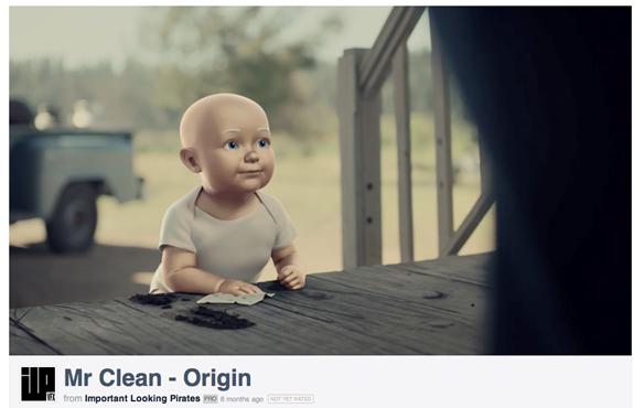
Fig 8. TV 2013. 60 sec Mr. Clean Origin. 3D animation.
The colour, 3D animated, television commercial, explains the life history and purpose of Mr. Clean, from when he was a small child to present day. The viewer is taken on a journey, which I will breakdown in a simplified way, using the Greiman’s actantial model (Danesi, 2007, p.108): (1) The subject: Mr. Clean (2) desires: cleanliness (3) he encounters the opponent: dirt and grime, while the (4) receiver: consumer (targeted viewer, consumers family), benefits from Mr. Clean’s desire (5) the consumer, by using the household cleaner Mr. Clean, helps to accomplish the cleansing action, while (6) the opponent; dirt and grime, attempt to hinder his cleaning. Actants are “the same ones found in ancient myths” and according to Danesi “Myths constitute ‘metaphysical knowledge texts’ for explaining human origins and actions” (Danesi, 2007, p.108). Greiman was able to deconstruct narratives from various cultures and time periods, and discovered a common structure. This theory was appropriated to create the myth of Mr. Clean as explained in the 2013 TV spot, and the conflict between cleanliness and dirt was first set up in the first TV commercial that aired in 1958. This myth has been the basis of P&G’s message to Mr. Clean’s target market for nearly 60 years andshows no signs of failing, as global sales are up.
3.4. Hero
Hero theory, as written by Thomas Carlyle appropriated the concept of Visuality to create and justify the hero, and this is done to maintain power over the population, and maintain the status quo (Mirzoeff, 2006). Carlyle’s concept of creating a hero by appropriating visuality, has been a technique used by advertisers for many years. Either the consumer is turned into a hero by buying a product, as is the case with iPhones, be the envy of your friends, or the actual product is a hero that the consumer wants to be part of, such as Harry Potter merchandise.
The visual device of Mr. Clean is quite unique in the product category of household cleansers, where the consumer uses a particular household product, and becomes a hero in their families/friends eyes. In the case of Mr. Clean, the product is the actual hero with the consumer admiring or even loving him.
One technique used to create the hero in the advertising is seen in fig 3, in one of the first Mr. Clean TV commercials. The brand character stands, in a pose, as if he is a statue, and is admired by the housewife looking up at him. In Fig 9, it is 57 years later, and the camera angle is lower, looking up at Mr. Clean, he is presented as heroic, standing with his hands on his hips, in a pose reminiscent of the work of Nazi propaganda filmmaker Leni Riefenstahl in the film Triumph of Will. The technique of low camera angles and statuesque poses of the subject has been appropriated in popular culture to create a noble subject and appears on album covers, comics and graffiti art. American superheros such as superman are drawn from a low camera angle, after they have completed a succesful action, and Mr Clean is presented in this way at the end of the 2013 commercial (Fig 9).

Fig 9. TV 2013. End Frame. 60 sec Mr. Clean Origin. 3D animation. USA.
In his book Mythologies, Roland Barthes explains the concept of connotative and denotative, where myth occurs when the consumer reads connotative meanings as denotative. This concept applied to the Mr. Clean visual device as seen in the two television commercials in fig 3 and fig 9, produces the following connotative meaning in the consumer: that the household cleaner named Mr. Clean is actually a male hero, a superhero. What this signifies is that a plastic bottle, filled with yellow liquid, is actually a male human, who is also a hero. This meaning is socially and culturally specific and not a natural association.
As I have argued and demonstrated in this paper, when advertising tools and techniques are applied to a consumer product, brand meaning is constructed, and can also be deconstructed by applying this method.
4. Conclusion
The result of the “super hero-izing” of Mr. Clean, who battles the enemy of dirt & grime raised the status of the housewife. In the 1950’s, American society was being reconstructed after the great depression and 2 world wars, the creation of a middle class, that in some cases couldn’t afford maid service, forced the new role of housewife to take on the cleaning. She was being judged in the new classless society being watched by her neighbours, friends, and family. The housewife became the observed. McCarthyism was everywhere, even in the home. The responsibility of the mother was to provide a good home for the family, above all cleanliness. In order to accomplish that, an enemy was created out of dirt and grime. American culture thrives on enemies: good vs. evil, black vs. white, dirty vs. clean. A myth was created about being dirty, grime was un-American.
It wasn’t good enough to be clean, it had to be a clean that shined. Cleanliness meant, sterile, clean mind, pro-America. Housewives were shamed into cleanliness. Not any type of cleanliness, but the cleanliness only obtained with the assistance of a new American male superhero that came in a plastic bottle called Mr. Clean. The battle was fought in the home, where we don’t see actual death, what we see are the positive results from using the brand. A white male superhero who raised the status of a housewife in the eyes of everyone who was watching her.
Since 1958 the western world has evolved, and so has Mr. Clean. Recently P&G updated his brand image by demonstrating Mr. Clean helping males clean (TV 2013), however this reboot was not soon enough. The European parliament voted in September 2008 to warn companies who use “sexual stereotyping” in advertising. American blogger and newspaper columnist Albert Mohler (2008) reported, “The (European) Parliamentary report argued that Mr. Clean, whose image dates from the 1950s, is an example of sexual stereotyping. Mr. Clean’s “muscular physique,” The [New York] Times reports, “might imply that only a strong man is powerful enough to tackle dirt”(Mohler 2008) (Carvajal 2008). This action by the parliament signifies that the brand has not been updated sufficiently for contemporary European ideology, and in my mind this warning creates questions regarding advertising messaging, should a white male be considered a hero by coming to the housewife’s rescue? If Mr. Clean was a person of African descent, what signs would be appropriated to create their story, and would they be connotatively interpreted as a hero? Is it correct for corporations to use Hero theory to promote commodity products that give corporations power through money, or should the hero only be kept for governmental/political use? Is it demeaning the concept of the hero -- as created in the bible and 18th century -- when it is reduced to marketing techniques to sell a commodity?
By applying advertising tools and techniques to analysis brands, we can observe the how and why brand meaning is constructed. These observations and learnings can then be applied to other forms of communication to deliver information to advance society, they do not only have to be applied to brands and corporations to sell products. I ask: Can doctors take learnings from advertising messaging construction to change behaviors in patients? Can advertising tools and techniques be applied to the Ebola crisis in order to deliver the correct information to the populace in a format that will not be rejected?
It is very easy to be negative about marketing by focusing on manipulation. We need to understand how advertising is created by its practitioners, and apply this knowledge to advance communication methods to benefit humankind. This method of breaking down successful branding through the analysis of the advertising tools and techniques, gives us the how’s and why of creating meaning. These learning’s and observations can then be applied to un-branded communications in areas where advertising methods are not even considered.
For example the Colombian government appropriated advertising tools & techniques to convince the guerillas to put down their weapons and come home for Christmas. The government went into the jungle and placed trip wires, that when activated, lit up a Christmas tree, with a message that said, “put down your weapons and come home to your family this Christmas” (Operation Christmas, 2011). I ask, can war be stopped through the application of advertising tools & techniques?
Also this paper raises doubts regarding my actions of merging advertising practise, and academic studies: should the practise of advertising learn from semiotic analysis? Is it worthwhile providing creative practitioners with various theories, to justify their design decisions?
Only time will tell.
Bibliography
1. AAKER, A, D. (1996) “Building Strong Brands.” New York. The Free Press.
2. ANONYMOUS. (1959) "Why Ajax Vanquished Mr. Clean," Advertising Age, August 24, 1959, p. 74.
3. BARTHES. R. (1972) “Mythologies”. New York. Hill and Wang.
4. BARTHES, R. (1977) “Image-Music-Text”. London. Fontana.
5. BENDINGER, B. (2009) “Advertising, The business of brands.” Chicago. Fourth (Media Revolution) Edition.
6. BENNETT, P. (1988) “Dictionary of marketing terms” Chicago: American marketing Association.
7. BLACK. http://www.twincities.com/nation/ci_25467610/mr-clean-artist-richard-black-ohio-dies-at (Accessed: February 20 2015).
8. CAPUA, M. (2006). Yul Brynner: A Biography. McFarland.
9. CAREY, C. (1998) “Mr. Clean Retains Marketing Muscle,” St. Louis Post-Dispatch, August 30, p. B3.
10. CARLYLE, T. (1966) “On heros, Hero-worship and the Heroic theory.” USA. University of Nebraska Press.
11. CARVAJAL, D. (2008) http://www.nytimes.com/2008/09/10/business/media/10adco.html?ref=business&_r=0(Accessed: February 26 2015).
12. CLIFTON, S. (2003) “Brands and Branding.” The economist. New Jersey Bloomberg press. Princeton.
13. DAIR, C. (2012) “Design with Type.” Toronto. University of Toronto press.
14. DANESI, M. (2006) “Brands”. New York. Taylor & Francis.
15. DANESI, M. (2013). “Encyclopedia of Media and Communication.” Toronto. University of Toronto press.
14. DANESI, M. (1999) “Of Cigarettes, high heels, and other interesting things.” NewYork, N.Y. St. Martin’s Press.
16. DANESI, M. (2007) “The Quest for meaning. A guide to semiotic theory and practice.”Toronto. University of Toronto Press.
17. DANESI, M. (2002) “Understanding Media Semiotics.” London. Arnold.
18. ECO, H. (1979) “A theory of Semiotics.” 1st Midland Books ed.
19. FLOCH, J-M. (1990). Marketing, sémiotique et communication. Paris, PUF.
20. FLOCH, J-M. (1990). Identités visuelles, Paris, PUF.
21. FRANZEN, G. and MORIARTY, S. (2009) “The science and art of branding” New York. M.E. Sharpe Inc.
22. GREIMAS, A, J. (1973). “Actants, Actors, and Figures. On Meaning: Selected Writings in Semiotic Theory.” Trans. Paul J. Perron and Frank H, Collins. Theory and History of Literature, 38. Minneapolis: U of Minnesota P, 1987. 106-120
23. GUILLEMETTE, L. and LEVESQUE, C. (2006), “Narratology” in Louis Hébert (dir.), Signo[online], Rimouski (Quebec), http://www.signosemio.com/genette/narratology.asp.(Accessed: February 26 2015).
24. GROUPE M. (1992) “Traité du signe visuel. Pour une rhétorique de l'image.” (Paris: Éditions Seuil), p. 361.
25. GROUPE M. (1995) ‘‘A rhetoric of visual statements’’, in Advances in visual semiotics: the semiotic web 1992-93 by Thomas-A. Sebeok and Jean Umiker-Sebeok (Berlin and New York: Mouton de Gruyter, 1995), p. 597.
26. HÉBERT, L. (2006), “The Actantial Model”, in Louis Hébert (dir.), Signo [online], Rimouski (Quebec), http://www.signosemio.com/greimas/actantial-model.asp (Accessed: February 26 2015).
27. IMB; South pacific: http://www.imdb.com/title/tt0052225/ (Accessed: February 26 2015).
28. INTERBRAND. http://www.interbrand.com/en/about-us/Interbrand-about-us.aspx (Accessed: February 26 2015).
29. KLEIN, N. (2000) “No Logo.” Toronto. Random house.
30. KRESS, G. (1996) “Reading images: The grammar of visual design.” London. Routledge.
31. LEHMAN, B. H. (1966). “Carlyle’s Theory of the Hero: Its sources, development, history, and influence on Carlyle’s work.” New York. AMS Press.
32. LURY, G. (2004). “Brand Strategy”, Issue 182, p. 32
33. LUPTON, E. (2010). “Thinking with type.” New York. Princeton Architectural Press. ISBN 978-1-56898-969-3
34. MARK, M, and PEARSON S.C. (2001). “The Hero and the Outlaw. Building Extraordinary Brands Through the Power of Archetypes” McGraw Hill, 1st edition.
35. McCARTHY S., M. and L., D. MOTHERSBAUGH. (2002): “Effects on Typographic Factors in Advertising-Based Persuasion: A General Model and Initial Empirical Tests.” Psychology & Marketing 19, no. 7-8 663-691.
36. McLUHAN, MARSHALL. (1976) Quoted in magazine “Advertising Age,” Sep. 3,
37. MIRZOEFF, N. (2006) “On Visuality.” journal of visual culture http://vcu.sagepub.com. SAGE Publications. London, Thousand Oaks, CA and New Delhi. Vol 5(1): 53–79 [1470 4129(200604)5:1]10.1177/1470412906062285
38. MOHLER, A. (2008) http://www.christianpost.com/news/a-sex-change-for-mr-clean-34538/(Accessed: March 3 2015).
40. OLINS, W. (2003) “On Brand,” London: Thames and Hudson.
41. OPERATION CHRISTMAS. (2011) https://www.youtube.com/watch?v=FMLoYpy_HFw (Accessed: February 23 2015).
42. OXFORD REFERENCE DICTIONARY. (2015) http://www.oxfordreference.com (Accessed: March 3 2015).
43. PROPP, V. (1968). “Morphology of the folktale”. Austin. University of Texas Press.
44. SCHNAKENBERG, R. (2000) Warc: “Procter & Gamble Company: Mr. Clean campaign.” Encyclopedia of Major Marketing Campaigns. Volume 1,
45. TRIUMPH OF THE WILL. (1935) https://www.youtube.com/watch?v=GHs2coAzLJ8(Accessed: January 1 2015).
46. TV (1958): https://www.youtube.com/watch?v=Ulh_oESf5nc (Accessed: Dec 31 2014).
47. TV (2013): https://vimeo.com/77231333 (Accessed: Web January 1 2015).
48. WALKER-SMITH. (2006) CBS News report. http://www.cbsnews.com/news/cutting-through-advertising-clutter/ (Accessed: December 31 2014.
49. WARC.com. (2007) “Mr. Proper – Talking Surfaces. European Association of Communications Agencies.” Bronze winner, Euro Effies.
50. WARC.com. (2010) “Winning Hearts and Minds: Why Best Buy, P&G and Charles Schwab use brand advocates” Chiaki Nishino, Fred Geyer. ANA Magazine. June 2010
51. WARC.com. (2008) “The role of helpers in advertising: Bridging the way from semiotics to storytelling.” Joseph Sassoon. ESOMAR. Qualitative Research, Istanbul, November 2008
52. VAN LEEUWEN, T. (2006) “Towards a semiotics of typography.” Information Design Journal and Document Design 14, no. 2 2006: 239-255.
53. VINTAGE. Sailor dress image: http://www.poshgirlvintage.com/1950s-navy-blue-sailor-dress-m-p-2598.html (Accessed: January 1 2015).
54. VOGLER, C. (1998) “The Writer's Journey: Mythic Structure for Writers,” Studio City, Michael Wiese Productions.
Illustrations:
Fig 1: Yul Brynner King and I. [Online image]: http://harlowgold.tripod.com/yulreviews.html. (Accessed: February 20 2015).
Fig 2: TV Commercial (Late 1950’s). Then and now. [Online image] www.Mrclean.com(Accessed: April 10 2014).
Fig 3: TV Commercial (Late 1950’s). media.mrclean.ca. [Online image] (Accessed: April 05 2014).
Fig 4: Mr. Clean Package. (late 1950’s). [Online image] http://galleryhip.com/mr-clean-vintage.html (Accessed: December 31 2014).
Fig 5: Magazine advertisement. (Late 1950’s early 1960’s). media.mrclean.ca [Online image] (Accessed: April 6 2014).
Fig 6: Magazine advertisement. (Mid to late 20th century) Then and now [Online image]www.Mrclean.com (Accessed: December 31 2014).
Fig 7. Logo. (2012) Then and now [Online image] www.Mrclean.com (Accessed: December 31 2014).
Fig 8: Important Looking Pirates. (2013): second 07 [Online film] https://vimeo.com/77231333(Accessed: February 26 2015).
Fig 9: Important Looking Pirates. (2013): second 57 [Online film] https://vimeo.com/77231333(Accessed: March 2 2015).
